Outdated no more: Imexoya's logo gets a bold upgrade.
How we transformed Imexoya Ghana Limited's outdated DIY logo into a bold, professional design that reflects their expertise in the construction industry.
Project Overview
Imexoya Ghana Limited, a construction company in Ghana, initially approached me to design and develop their first website. During the consultation, I identified a significant gap in their branding—an outdated DIY logo that did not reflect their professionalism or align with their industry. I recommended starting with a logo redesign to establish a strong, cohesive brand identity before proceeding with the website.
Key Issues Identified:
- Lack of an existing website to showcase services and portfolio
- DIY logo that lacked polish and professionalism
- Weak brand identity with no modern visual consistency

Service Rendered
I delivered a holistic branding and digital solution:
- Logo Redesign: Revamped the logo while retaining its meaningful elements to preserve originality.
- Brand Identity Integration: Applied the new branding consistently across digital and physical assets.
- Website Design and Development: Built a modern, responsive website from scratch to showcase Imexoya’s services and projects.
Logo Description
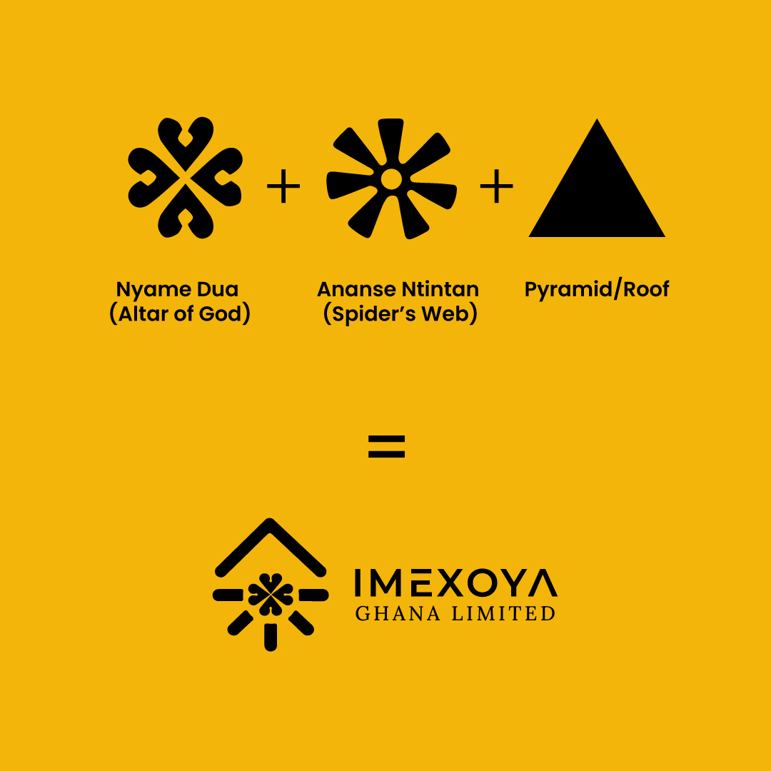
The redesigned logo retained and refined the essence of the original elements:
1. Ananse Ntintan (Spider’s Web): Symbolizing creativity and interconnectedness.
2. Nyame Dua (Altar of God): Representing protection and guidance.
3. Pyramid/Roof: Emphasizing strength, stability, and the construction industry.
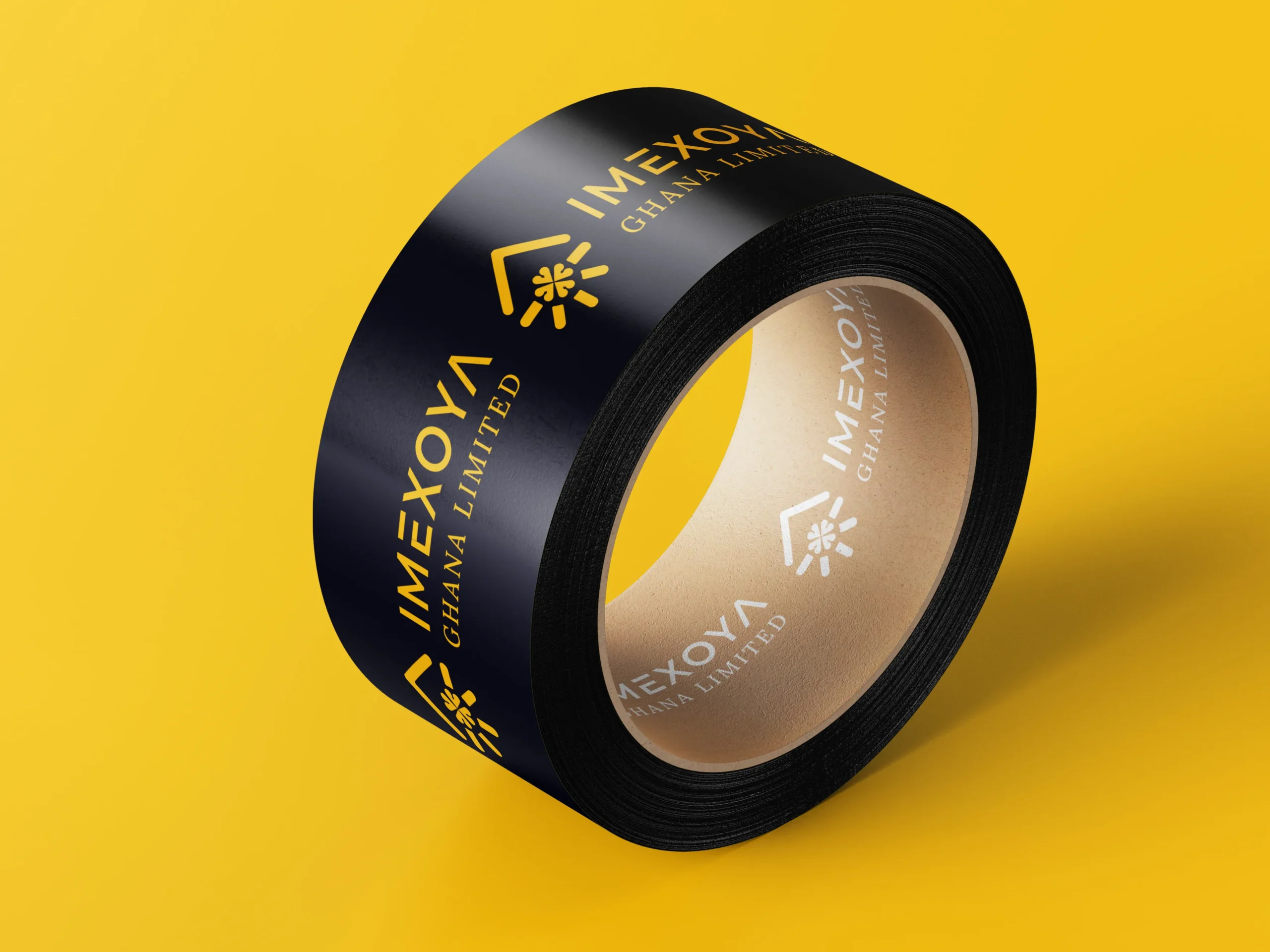
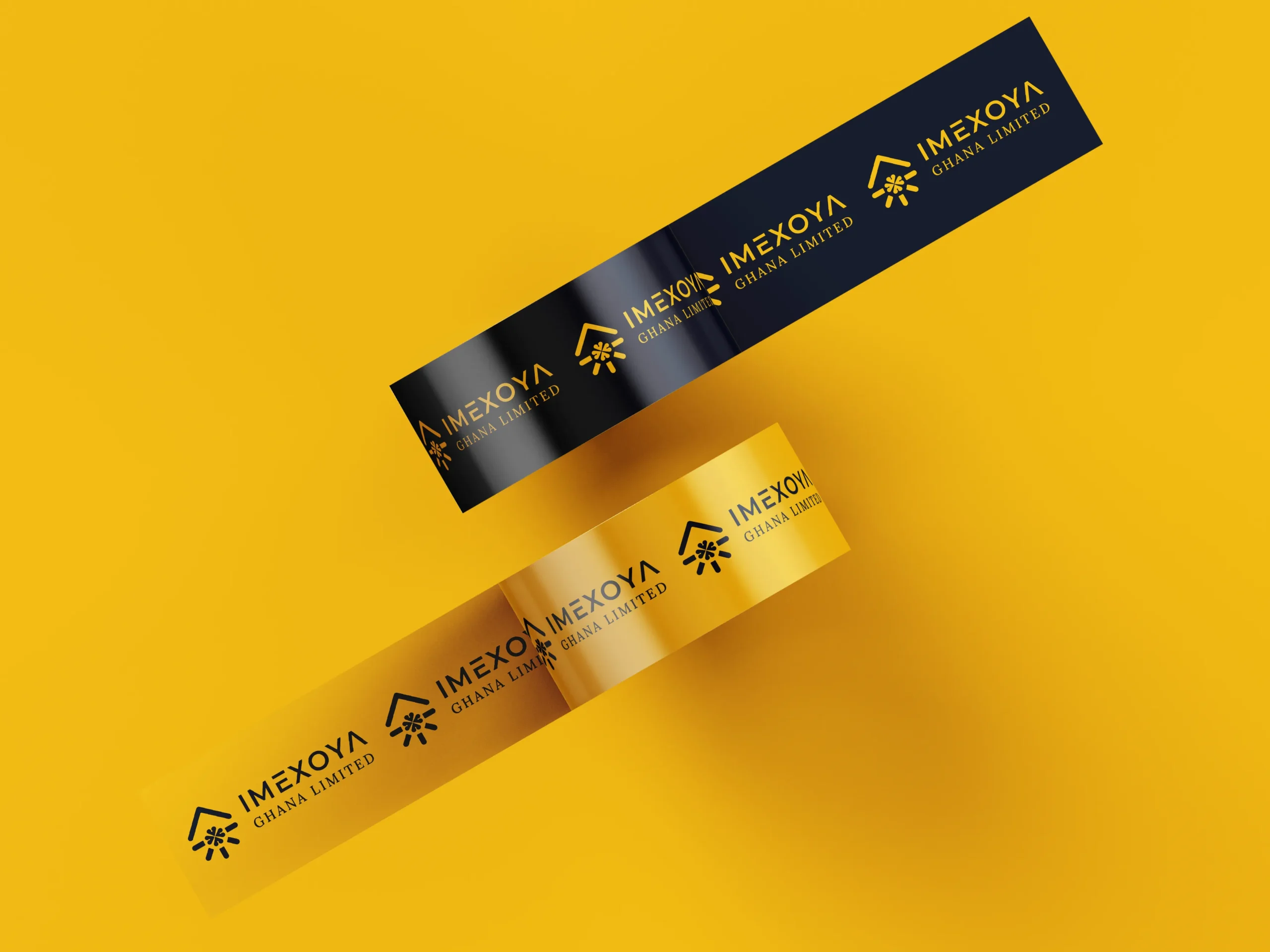
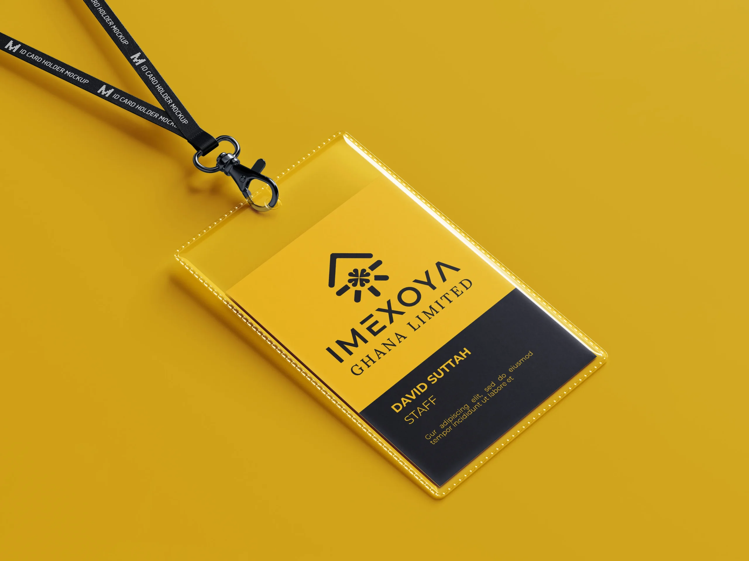
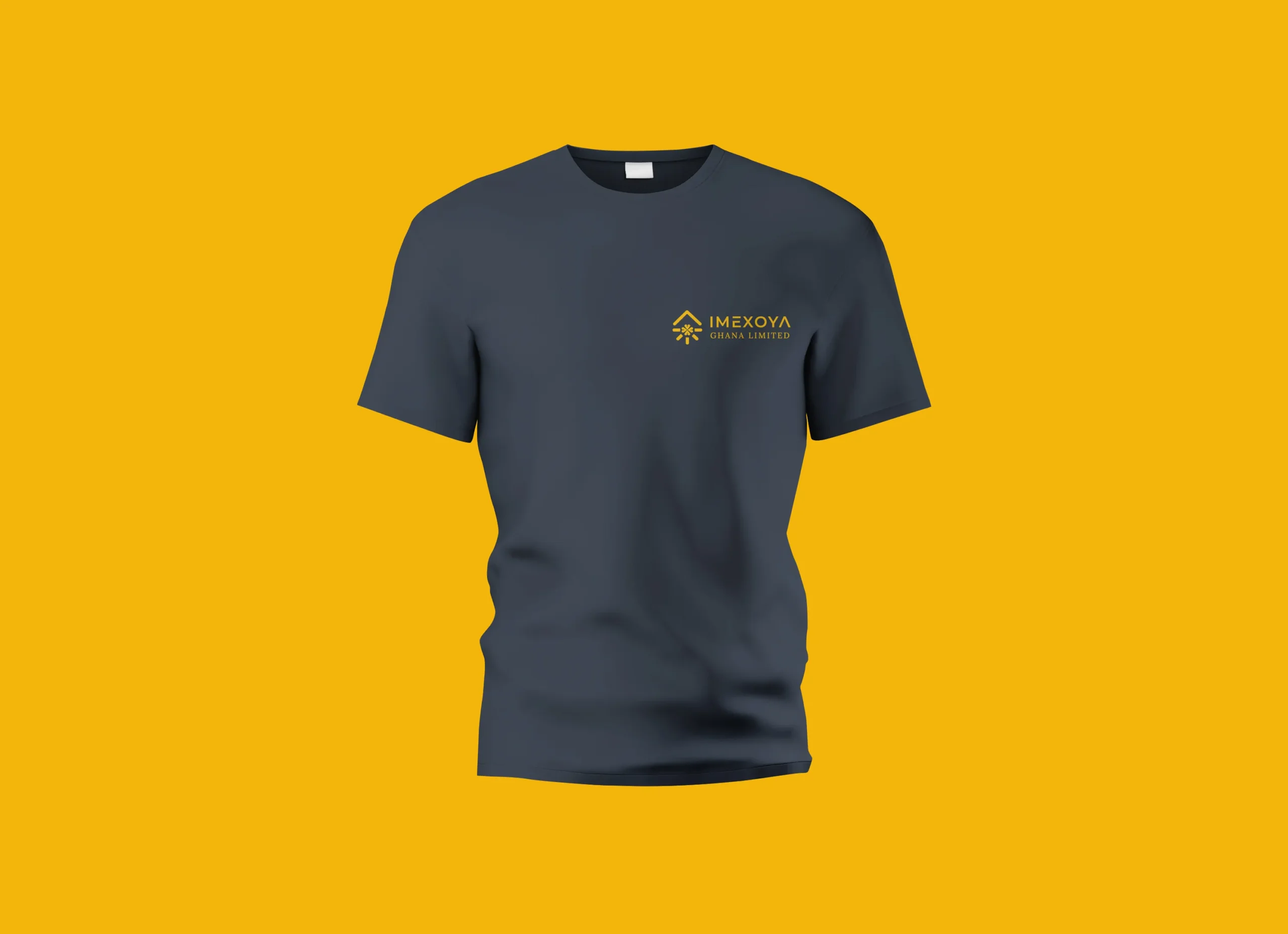
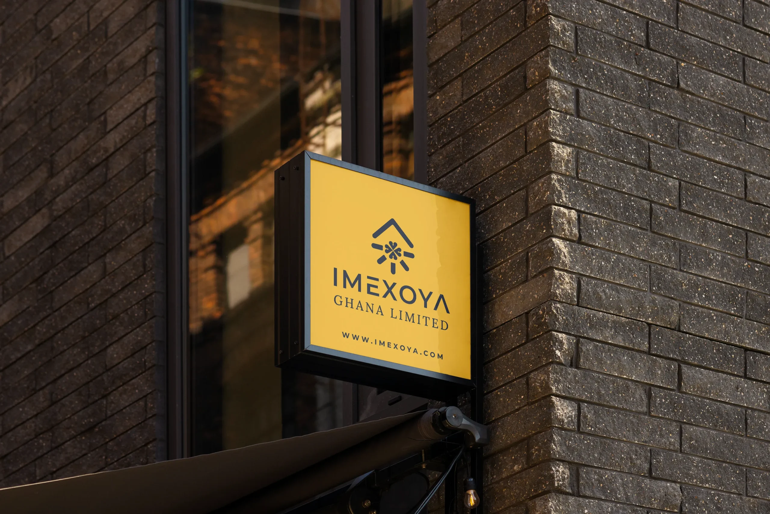
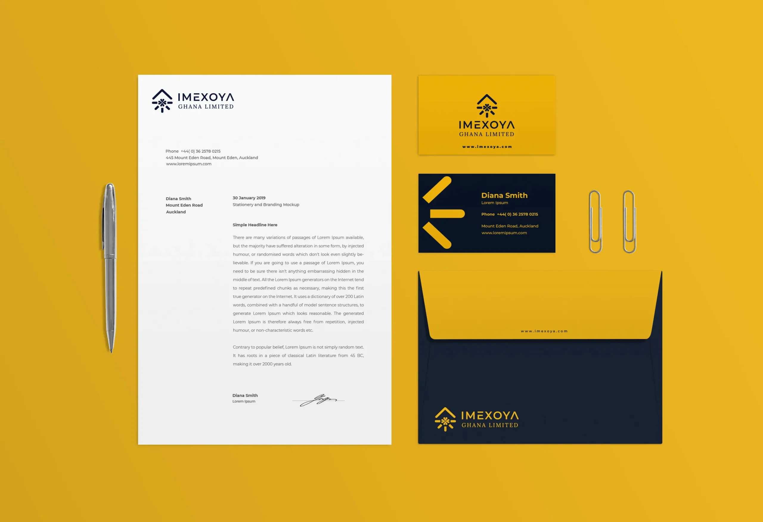
Logo Application
In today’s fast-paced world, many of U&U Shipping LLC’s customers rely on mobile devices for quick access to shipping information on the go. Recognizing this need, I prioritized mobile and tablet optimization to ensure that users have a seamless experience regardless of device.
The Color Palette
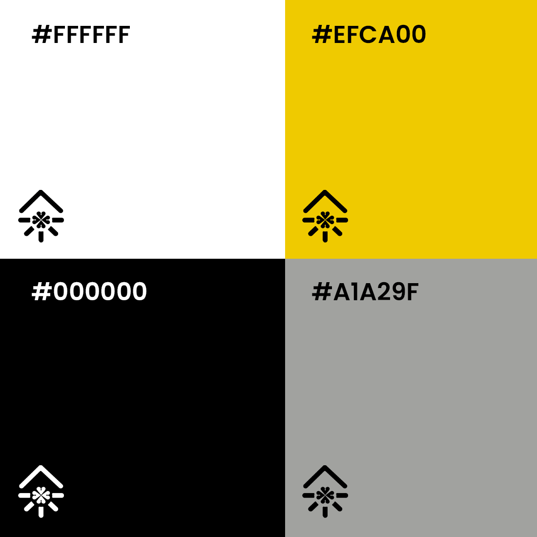
The refined color palette for Imexoya Ghana Limited reflects their values of excellence, strength, and professionalism. Each color was chosen to enhance the brand’s modern appeal while maintaining versatility across applications:
- #EFCA00 (Gold): Symbolizing excellence, creativity, and quality in construction.
- #000000 (Black): Representing strength, authority, and professionalism.
- #A1A29F (Gray): Adding a touch of balance and sophistication to the overall design.
- #FFFFFF (White): Signifying clarity, simplicity, and a clean aesthetic.
These colors create a cohesive, impactful brand identity that communicates trust and reliability.
The Result
The logo and brand identity redesign delivered tangible results for Imexoya Ghana Limited, including:
- Professional Brand Representation: The new logo and refined identity elevated their image, aligning their visual presence with their industry expertise and credibility.
- Improved Client Perception: The polished design instilled confidence in clients and stakeholders, fostering trust and enhancing their reputation.
- Versatility and Scalability: The logo is now easily adaptable for a wide range of applications, from business cards and brochures to construction site signage and uniforms.
- Brand Recognition: The cohesive identity has increased brand recall and differentiation in the competitive construction sector.
- Employee Pride: The updated branding boosted internal morale, with employees taking pride in a professional and meaningful representation of the company.
By modernizing their logo and building a cohesive brand identity, Imexoya Ghana Limited is now better positioned to attract new clients and establish themselves as a trusted leader in their field.
Client Says...
"We’re beyond thrilled with our new logo and branding. It perfectly captures who we are and what we stand for. It’s professional, modern, and meaningful. This redesign has given our company a new sense of pride and confidence—we feel ready to take on bigger opportunities!"
